 UX case study
Role of UX Research in improving conversion
Hypothesis generation for Subscription Video on Demand platform based on secondary quantitative data in the Polish market. UX/UI redesign of subscription plans, payment and sign up process.
UX case study
Role of UX Research in improving conversion
Hypothesis generation for Subscription Video on Demand platform based on secondary quantitative data in the Polish market. UX/UI redesign of subscription plans, payment and sign up process.
February 2024 · 8 min read
Confidential data is not disclosed. All rights are reserved by their respective owners.
Confidential data is not disclosed. All rights are reserved by their respective owners.
Background
If you enjoy binge-watching, you're likely already familiar with Over the Top (OTT) services. This case study takes a closer look at the user experience of a subscription video-on-demand platform.
Problem Statement
When scaling to the European market, the streaming platform faced a challenge in increasing customer retention and converting more users from free trials to paid subscriptions. Specifically, the conversion rate in Poland of users who opted for the 14-day trial for 1zł indicated a need to improve the user experience and make the transition to paid plans seamless.

UXR Key findings
In 2023, Blik was the top choice for digital payments in Poland, chosen by 78% of respondents. Card payments and e-wallets followed as next popular options.
The security when it comes to financial payments was the second most important benefit of subscription services perceived by respondents in Poland in 2019.
From 2022 to 2023, the trend remains stable in Poland, as users perceive high value in affordable pricing as one of the top reasons to pay for the subscription.
In 2022, a third of Polish respondents who hadn't subscribed in the last 12 months stated the dislike of commitments as the main barrier to making a purchase.
Access to lots of channels is the main driver for purchasing TV subscription, chosen by 61% of Polish respondents in 2023.
Sign Up process might be a key barrier to the desired outcome
In the current system, the "Sign In" button was confusing as it led to both sign-in and sign-up flows in the same modal window. To improve the UX, I suggested separating the two actions and making the sign-up process a full-screen to eliminate distractions.
Also, I introduced the SSO (Single-Sign-On) option, so that the user could log into multiple connected systems (e.g. app, website, TV) simultaneously.
In the UI, I emphasized the importance of alternate sign-up options to give users flexibility.
Lastly, I suggested such UX Writing improvements: replace “Sign In" with the “Log in” to omit confusion when differentiating from the “Sign Up”; make CTA actionable by changing it from the “Phone Number” to “Enter Phone Number”; change the promotional text in this step from information on how many users already joined the platform, to the copy that brings more attention to the value proposition.
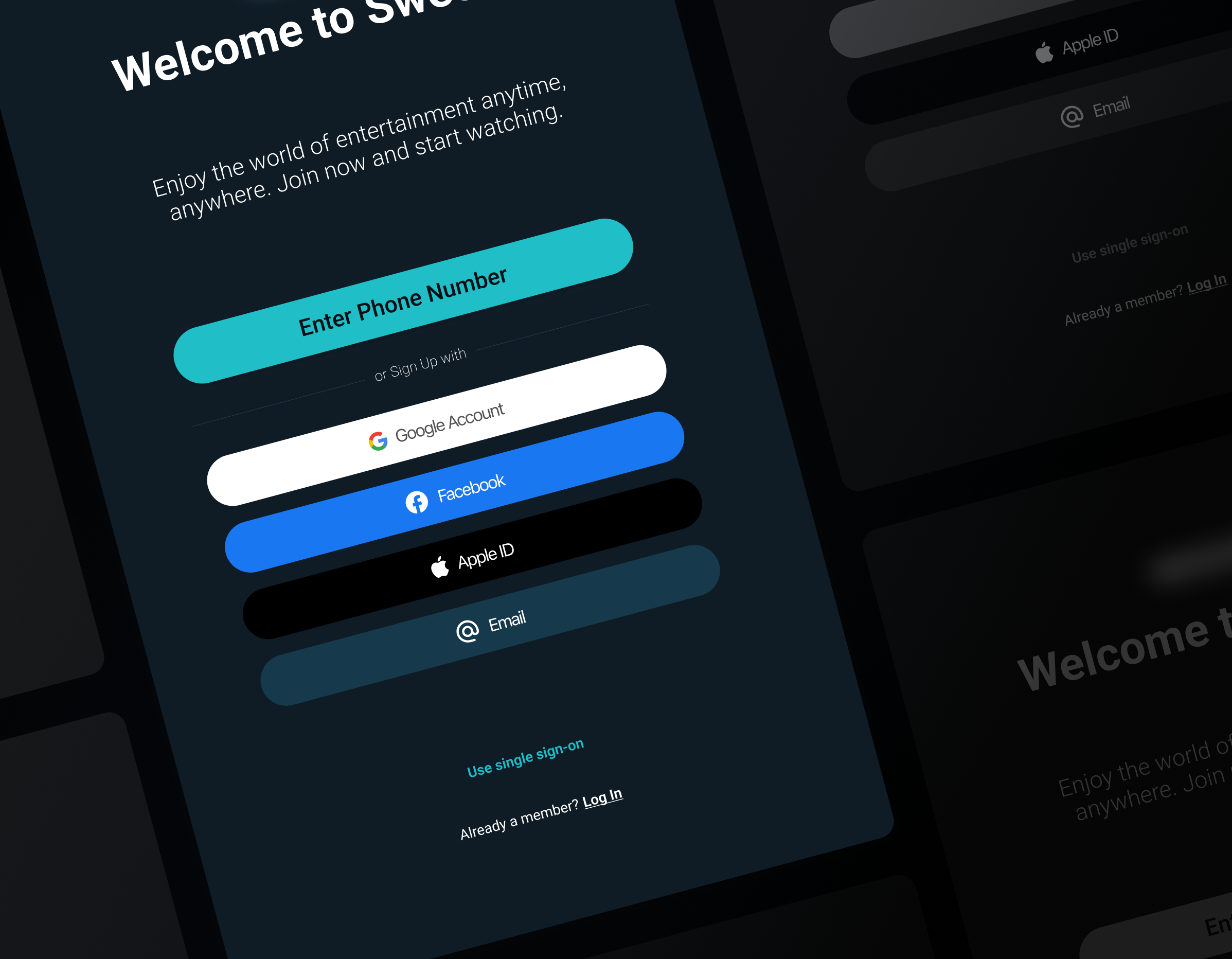
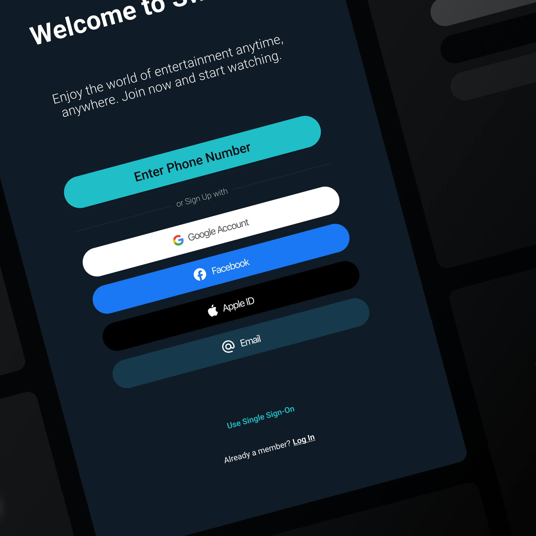
“Enjoy the world of entertainment anytime, anywhere. Join now and start watching.”
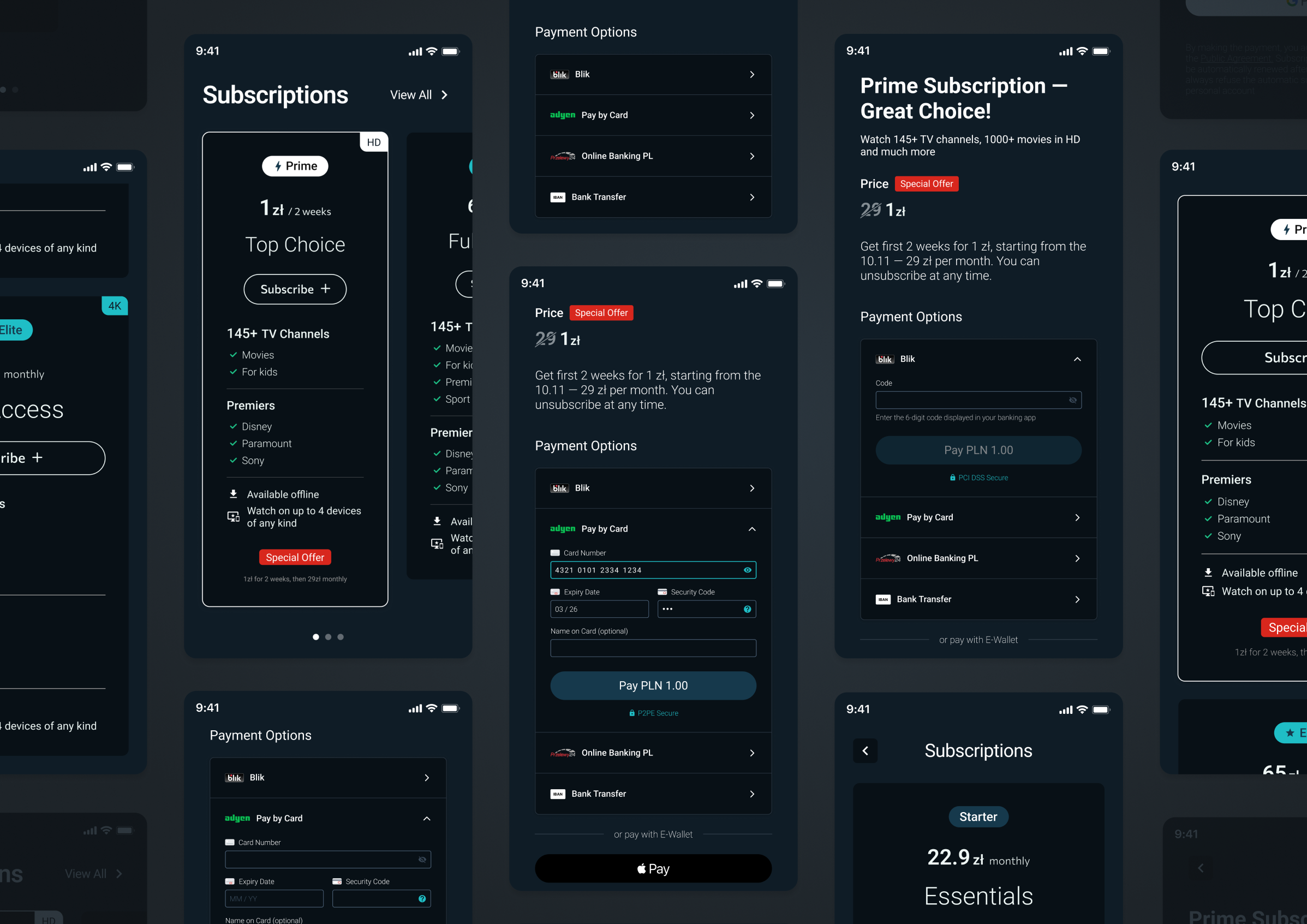
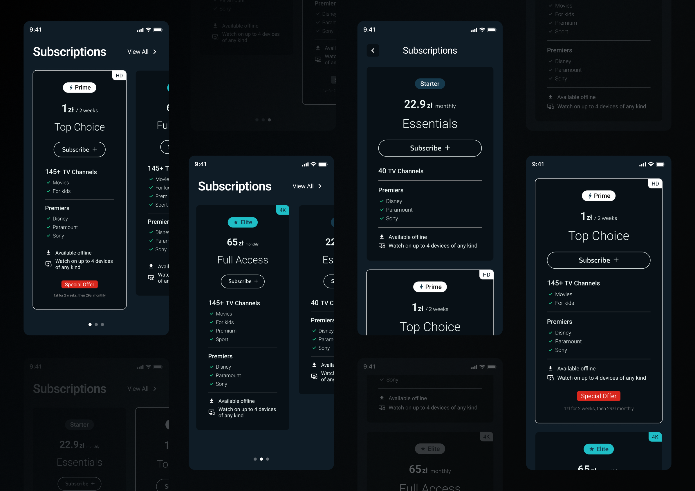
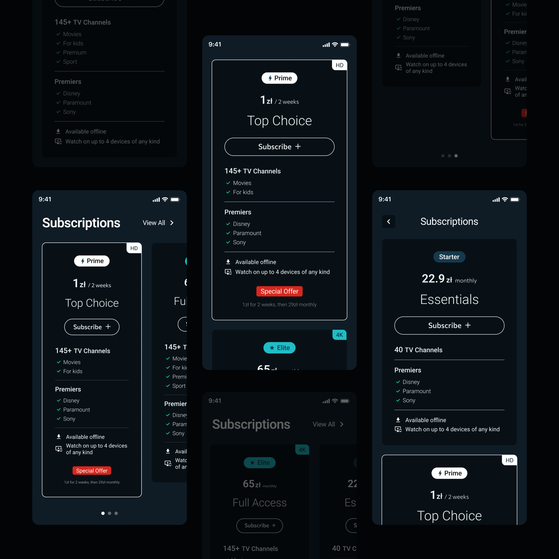
Subscription Plans optimization
Audience research that pays for a TV subscription opens the opportunity to expand by showcasing the value proposition.
From that UXR finding key suggestions were to highlight the perk of TV channels amount, bring more attention to the high video quality and accent on premieres’ brands.
I renamed plans to better resonate with value that customers get (from S/L/M to Starter/Prime/Elite).
I’ve also used the classic approach: the plan that is most profitable* is situated in the middle. In such cases “profitable” doesn’t always mean it is the most expensive for customers.
I’ve added the label to highlight the video quality perk and moved repetitive secondary perks from plans’ cards to the detailed view.
Based on research by Ortega & Tabares (2023), the price ending in .99 is unconsciously more affordable. However, affordable and luxury do not align well, so to sell higher-quality service .00 pricing is better.
That’s why for the “Elite” (earlier “L”) subscription I suggested removing odd-even pricing.
Save by leveraging external secondary data
The importance of secondary data in UXR is in its wider reach that helps contextualize your research and ensure the effort is justified. There is internal secondary data like tracking, and external such as industry reports and so on. However one should not solely rely on the external secondary data itself, checking already available sources of information is feasible, time-saving and often free or cheaper than running a study.
Anyways not any piece of information is useful so to differentiate if it is, you can ask yourself these questions:
Is this information relevant to your research? In general like demographics and in other ways as for example if their questions were too specific.
Is the source reliable? Which methods did they use and were they properly applied? I wouldn’t recommend relying on others’ qualitative research findings ever, as the chance it really works for your specific research need is at its lowest.
Were there enough participants for data to be considered quantitative? Even if the study is called quantitative but the respondents amount is small then the answers are considered random or accidental.
Is it outdated? Not always being outdated is regarding the year of when study was published, but more about the lived context influenced by external factors.
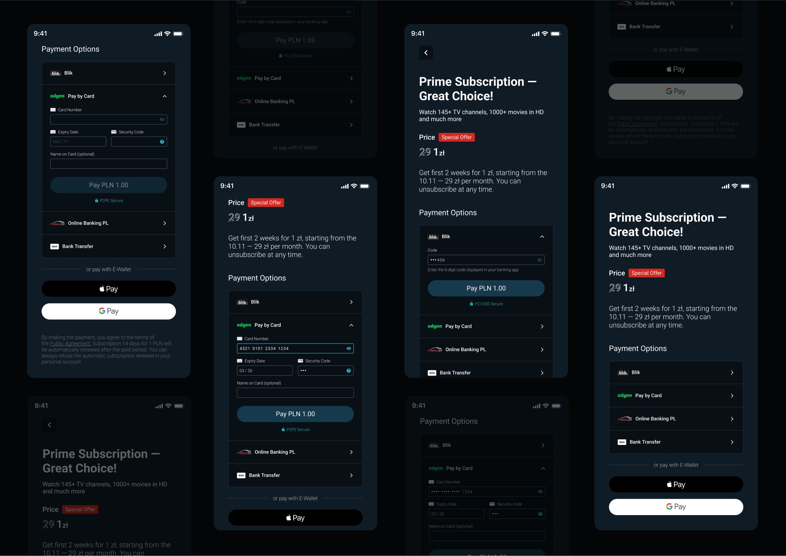
Increasing conversion via Payment Form redesign
According to a consumer insights survey by Statista conducted among 699 Polish respondents aged 18-64 years, the most used mobile payment brands are Blik, Google Pay, and PayU.
Resulting in my design suggestion to highlight Blik, consider integrating PayU if feasible, and maintain support for popular e-wallet options like Google Pay and Apple Pay. The other research, which was conducted by Adriana Sas who specialises in society and the economy, targeted e-shoppers to find preferred digital payment methods in Poland. The Computer-assisted web interviews (CAWI) method was used and survey’s results from 2023 indicated that Blik is the most popular payment method, followed by payment by card and E-Wallet options.
That’s why I recommended changing the order of payment formats in a form to prioritise Blik, following it by card payment, and then E-Wallet options. The survey published on Statista with 2 000 respondents aged 18-65 explored the perceived advantages of subscription services compared to one-time services in Poland in 2019. Its results highlighted security in financial transactions as the second most valued benefit when buying a subscription.
As a conclusion, showing that it's crucial to ensure that the payment process is perceived as secure and so is trusted. Firstly I increased transparency by providing specific information on the form payment process security. Then, to make the trusted provider more recognisable I’ve aligned the Adyen logo with their branding rules.
The clarity also plays a huge role in the processes that require trust from the user, so there is no place for confusing input labels. Input labels represent data format, so for example the MM/DD label is required, however CVC/CVV label might be conversely confusing as there’re also CVC2/CVV2/CID/CSC code names.
I won’t cover the input fields validation topic in this case study as they were done well and needn’t redesign. But talking about input fields in general, clear inputs are easier to read, and that leads us to accessibility considerations. I improved the color contrast of course, but it is important to remember that accessibility goes far further than that and so for instance I’ve added more spacing between numbers (e.g. Card Number) to increase readability and make design more inclusive.
Most importantly, the sensitive data should be visually hidden in the form as for example the Security Code and Card Number. That’s why I introduced the icon button that allows the user to turn visibility on and check their input.
How to seamlessly transition users from free to paid subscription
The popular strategy to make the transition from a free trial to a paid subscription as easy as possible is to break the price down in half before billing the regular price.
Proposed transition starts with a 1 week free trial where no card is required. Later, the card details are requested to continue into 2 weeks of special offer for 1 zł. After the offer ends, the user is automatically billed for the next 2 weeks but with a 50% sale off the price. Next, the full price is paid monthly, being billed per 11 months.
This way the user spends more time subscribed, leading to higher commitment, which then results in lower cancelling rates.
However, the A/B testing is recommended, to eliminate risks and ensure that influence on all metrics is taken into account beforehand.
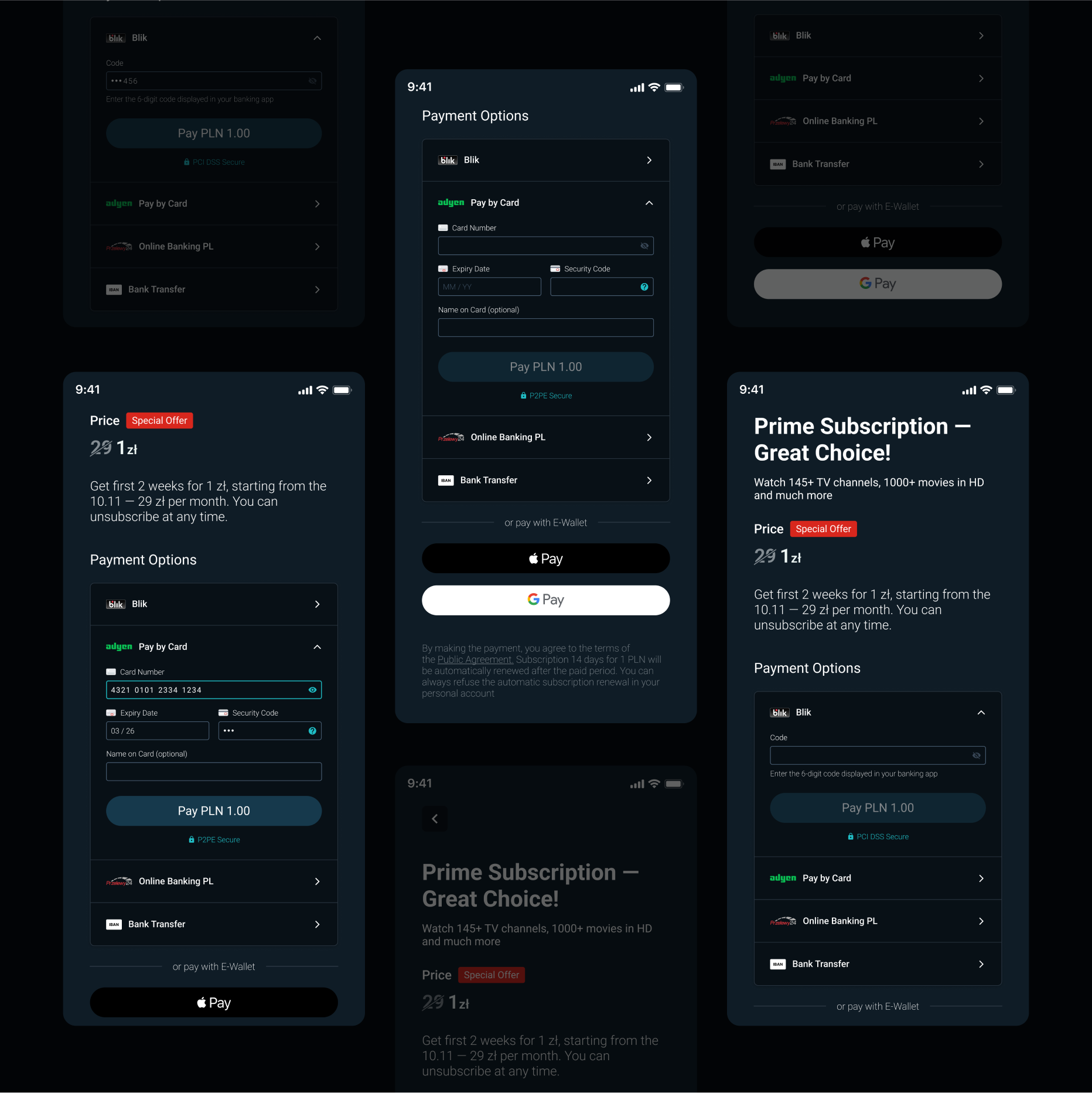
Video Description
The video doesn't contain any sound. It demonstrates a part of the flow of a user buying a subscription.
The user is browsing through promotional cards that display each plan's perks. They select a Prime subscription that has a special offer and are then taken to a page that explains the discount process. On that page the user can choose from 6 payment options, including Blik, payment by card with Adyen, Online Banking PL and IBAN Bank Transfer, as well as E-Wallet options of Apple and Google Pay.
When the user taps on "Pay by Card," the input fields for card details expand. The Card Number field has an icon button that unhides the numbers, and once the user fills in the Expiry Date and Security Code, the payment button becomes enabled. Underneath the button, there is a lock icon with text that reads: "P2PE Secure."
On the other hand, if the user chooses the Blik payment option, they are prompted to enter a 6-digit code displayed in their banking app. After the code is entered, only the last 3 numbers are displayed for security purposes.